FFT Investment Brief - The Yield Curve as an Indicator of Economic Recessions
DOWNLOAD PDF
Executive Summary
We are in the midst of the second longest economic expansion in US history (and soon to be the longest in just a few months). At some point, growth is likely to slow; and perhaps go in reverse. If that happens two quarters in a row, by most definitions (see the appendix for a formal definition), we will enter a recession.
Fears of an imminent recession magnified when the three-month to ten-year Treasury yield spread turned negative on March 22nd (the ten-year yield dropped to 2.44% compared to 2.46% for the three-month yield), prompting headlines in the financial newspapers about the yield curve inversion.
In this paper, we seek to examine, both in economic theory and using empirical evidence, the usefulness of the yield curve as a predictor of future US recessions and its relevance in today’s economic regime. Using the spread between the three-month and ten-year Treasury yields as a measure of the yield curve shape, we create predictive models to estimate the probability of a recession three, six, 12 and 24 months into the future.
Confirming past academic research, we find that the inversion of the yield spread is a strong indicator of future US recessions. Models indicate both the yield curve’s statistical significance in historical data, as well as its predictive power in forecasting recessions out-of-sample as far ahead as 12 months forward. In addition, models that use both the yield spread and the Fed funds rate were more successful at reducing false positives than models including only the yield spread.
The results suggest that the yield curve and interest rates contain useful information in the evaluation of business cycle trends for practitioners, and may provide constructive insights in areas such as asset allocation, financial planning and forward-looking financial models such as capital budgeting.
Based on data at the end of March 2019, the model’s estimated probability of a recession 12 months ahead is over 20%, which may be deemed as a relatively high chance of a future recession. However, unique aspects in today’s socioeconomic and political regime, such as the effect of recent quantitative easing, differ from past observations, on which the yield curve model is based. As with many econometric techniques, this analysis supposes that the future looks like the past (it never does exactly), and also looks to hold many confounding factors constant. In the real world, that is impossible, and feedback loop effects can influence the way markets move from here.
Our conclusions aren’t prescriptive, and indeed, they are based on estimated probabilities. The shape of recessions and the impact on capital markets may vary greatly. Knowing with certainty when a recession will occur won’t allow an investor to optimize their investments. There are too many unquantified variables. That said, we look forward to discussing the implications and relevance of this research with our clients and friends of the firm.
Background
The US economy is showing signs of nearing the later stages of the current cycle, leading many to question whether a recession is on the near horizon. For investors and practitioners, the ability to anticipate recessions may provide insights for asset allocation, financial planning and portfolio repositioning ahead of future market drawdowns. Further, it may assist in the construction of model assumptions such as capital budgeting and cash flow models. In monitoring changes in the business cycle, economists follow several leading indicators of business cycle changes, including:
- Unemployment claims
- New manufacturing orders
- Building permits
- Business sentiment
- Stock market performance1
Indices also exist that consider a combination of economic indicators, such as the Conference Board Leading Economic Index or the Chicago Fed National Activity Index.
The economic indicator which has perhaps drawn the most attention recently is the yield curve. A yield curve inversion, where long-term rates are lower than short-term rates for debt of similar credit quality, is widely known to have preceded US recessions in the past (a claim which we examine later in Table 1). The press recently highlighted the start of a yield curve inversion as measured by the 1- to 5-year Treasury yield spread. However, this particular spread shows only part of the picture, as other yield spreads such as the difference between the 2- and 10-year yield, are not negative. Indeed, recent market dynamics have led to a yield curve that has taken on an atypical non-monotonic shape with a kink at the one-year yield, as seen below.
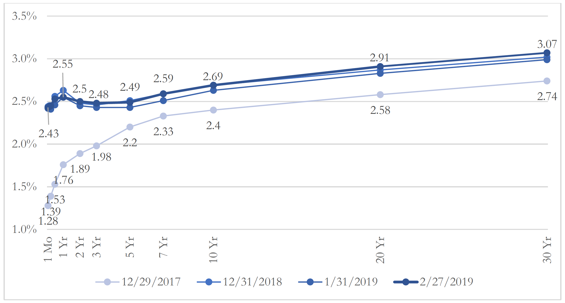
Chart 1: Treasury Yield Curve – Selected Dates Showing Kink in Curve
The Shape of the Yield Curve to Predict Recessions
The yield curve is usually upward-sloping. This can be explained by the liquidity preference hypothesis, which posits that if investors are risk-averse, bonds with longer maturities must offer a higher yield to compensate for bearing higher risks of unexpected future interest rate increases. This is also known as the term premium. However, the yield curve can invert due to offsetting forces, two of which are outlined below.
First, short-term interest rates are typically driven by monetary policy. A contractionary monetary policy, often used to control inflation, increases short-term rates while slowing down the economy by tightening credit. Second, long-term interest rates are driven by expectations of the future real interest rate and future inflation. There may be downward pressure on long-term yields if there are expectations of a slowdown in economic activity, as lower expected inflation and interest rates increase the attractiveness of long-term bonds. These two points may explain the inversion of the yield curve before looming recessions.
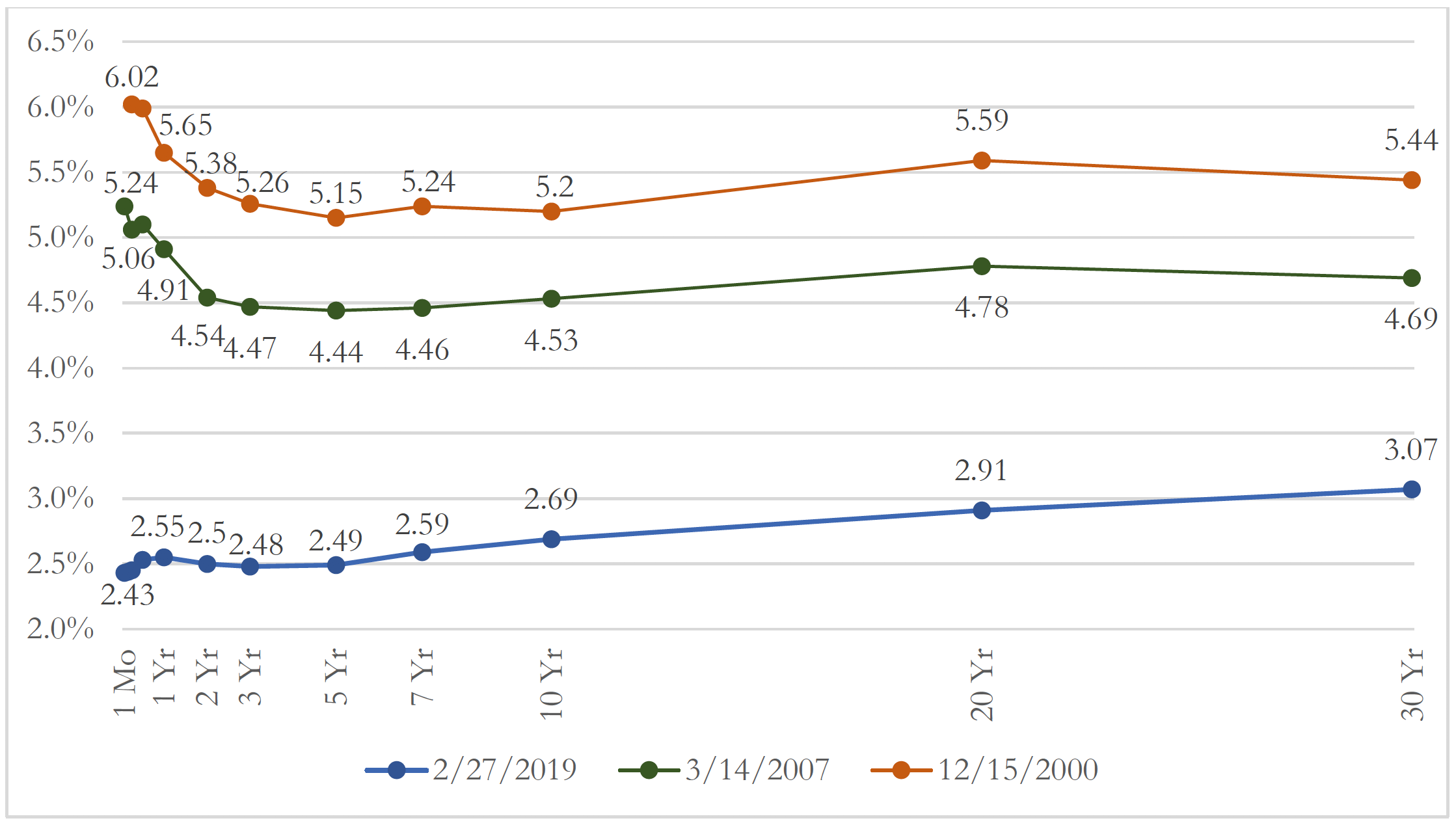
Chart 2: Current Treasury Yield Curve vs. 2000 & 2007 Inverted Yield Curves
Recently, the financial media announced with great fanfare the start of a yield curve inversion between the 1- and 5-year yields. However, Chart 2 suggests that today’s “yield curve inversion” is not yet as apparent as others that have preceded recessions. The longer-maturity end of the yield curve may also be artificially low due to the $3.6TN injected into the market for the quantitative easing (QE) program between 2008 and 2014. The QE program reduced long-term rates by purchasing longer-term Treasury securities and agency MBS. A FEDS Notes article (2017) suggested that the QE program may have depressed the 10-year Treasury term premium by about 1%. Is today’s yield curve prematurely flat? Could the QE unwinding prevent the yield curve from inverting in the next 5 years? The only other precedent was in 1932 when the Fed bought $1BN in Treasuries (about $17BN in today’s dollars). Available historical data has scant account of a similar exogenous influence.
Analysis of Yield Curve Inversions
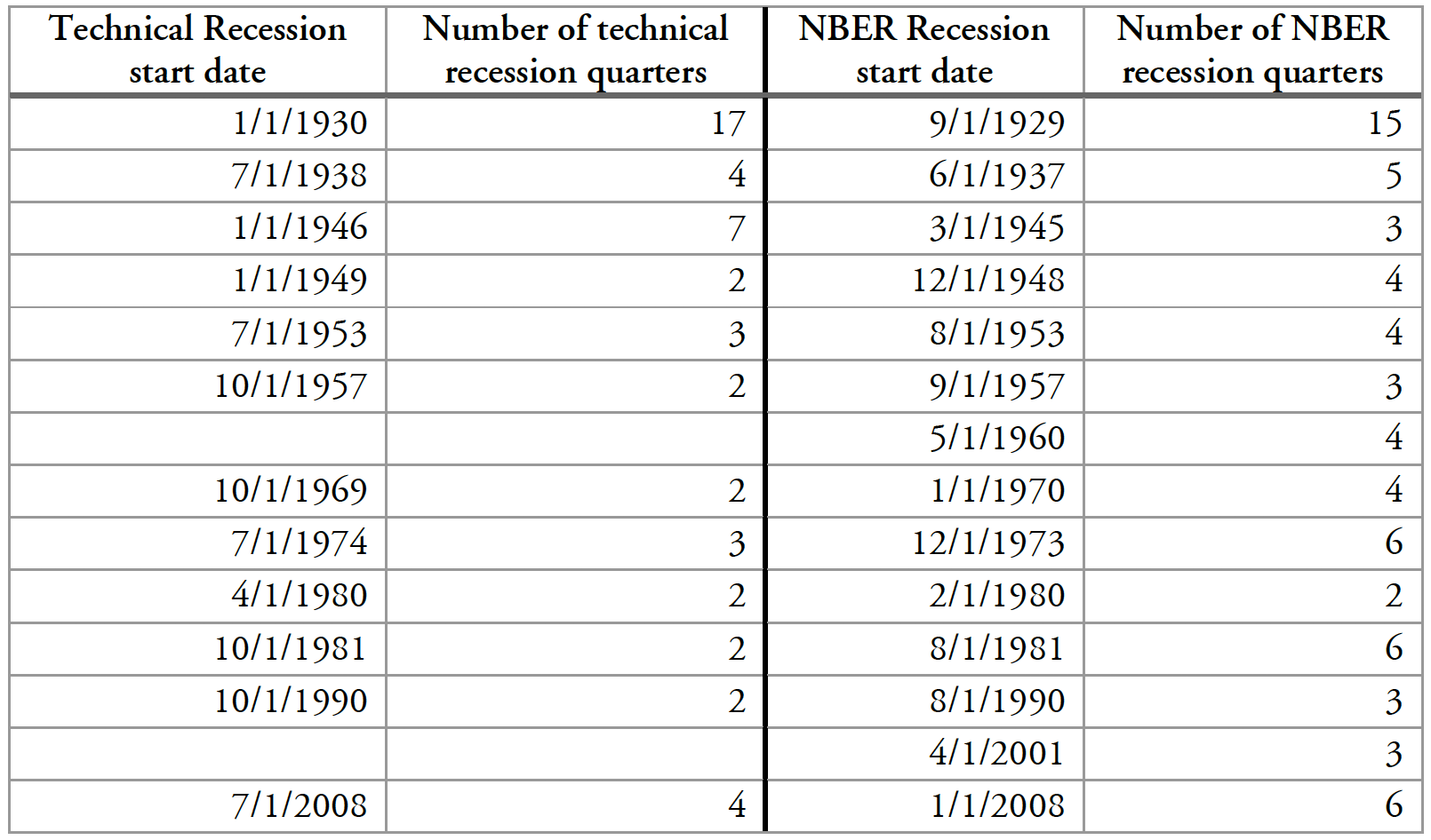
Since 1970, the yield curve has inverted before every recession2. Table 1 lists all yield curve inversions and recessions since the late 1920’s. As a measure of yield curve inversions, we consider both the 3-month to 10- year Treasury spread, which is prevalent in academic research, and the 2- to 10-year spread, which is often quoted by financial news. The choice of the yield spread appeared immaterial; both measures of yield spreads inverted at similar time intervals.
Interestingly, in Table 1, two false positives can be observed: in 1966 and 1998, yield curve inversions did not lead to recessions. False negatives are also seen in earlier years: no yield curve inversion preceded the 1937-1961 recessions. However, this period includes World War II and the Korean War, which could be considered as deviations from “normal” conditions.
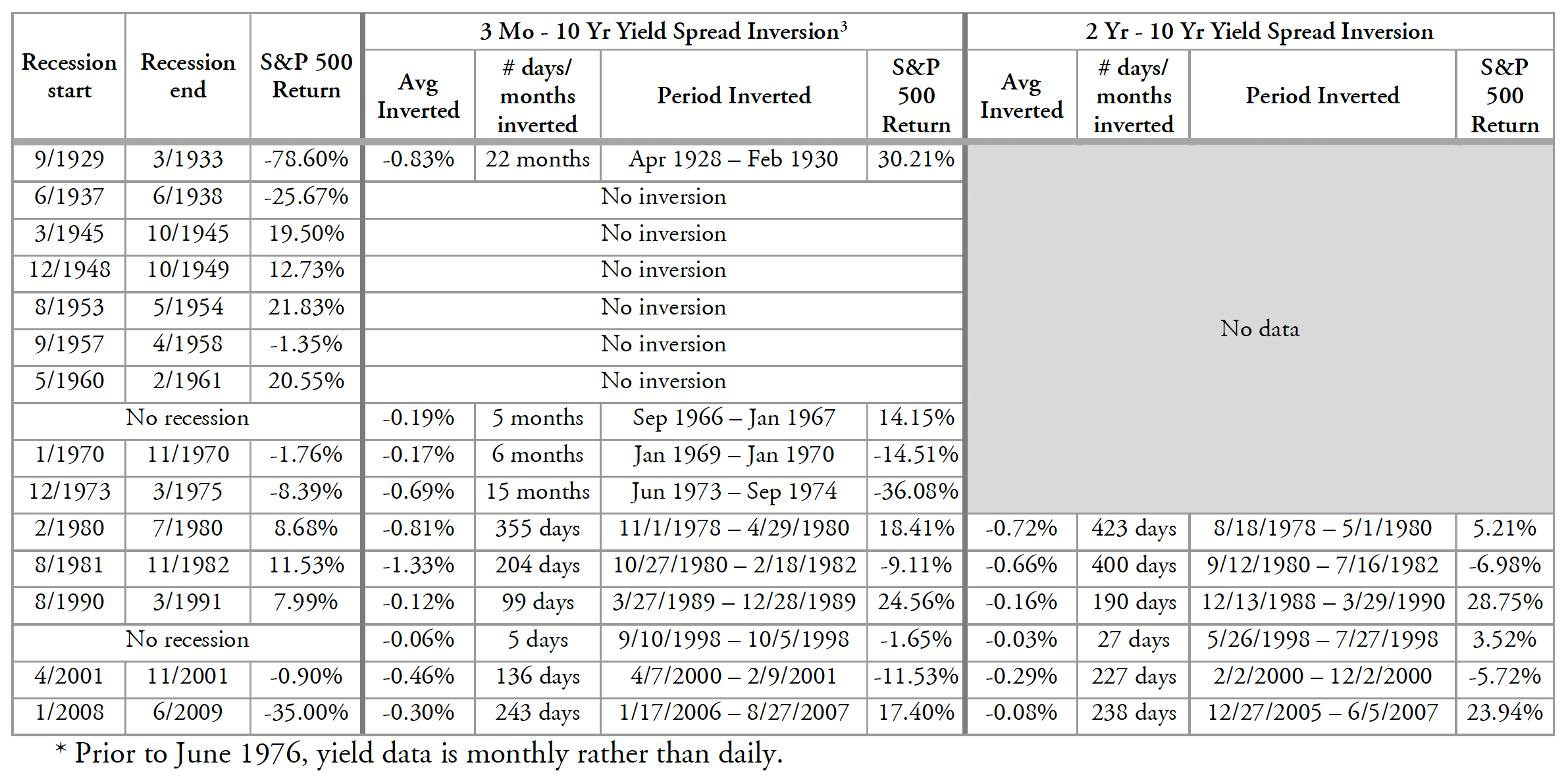
Table 1: Yield Curve Inversions and US Recessions
A Yield Curve Prediction Model
The data outlined in Table 1 suggests that the relationship between the yield curve inversions and economic recessions is more than just coincidental. Is the yield curve statistically significant in predicting future recessions? We created a number of models to test this4. In particular, we found that the 12-month ahead forecast model that uses the 3-month-to-10-year yield spread as its predictor (Model 1) provided fairly useful predictions both in-sample and out-of-sample. Chart 3 illustrates the model predictions. The gray areas represent actual recession periods, while the blue line indicates the model’s estimated probability that a recession will occur at that time. In most cases, actual recessions were correctly predicted, as indicated by the spikes in estimated recession probabilities. We also test the model predictions with data on which the model was not trained (the out-of-sample blue area). The results are fairly satisfactory as the model successfully predicted the 2001 and 2008 recessions, albeit somewhat too early. Our analysis corroborates a variety of academic literature in finding that the yield spread is statistically significant in predicting recessions.
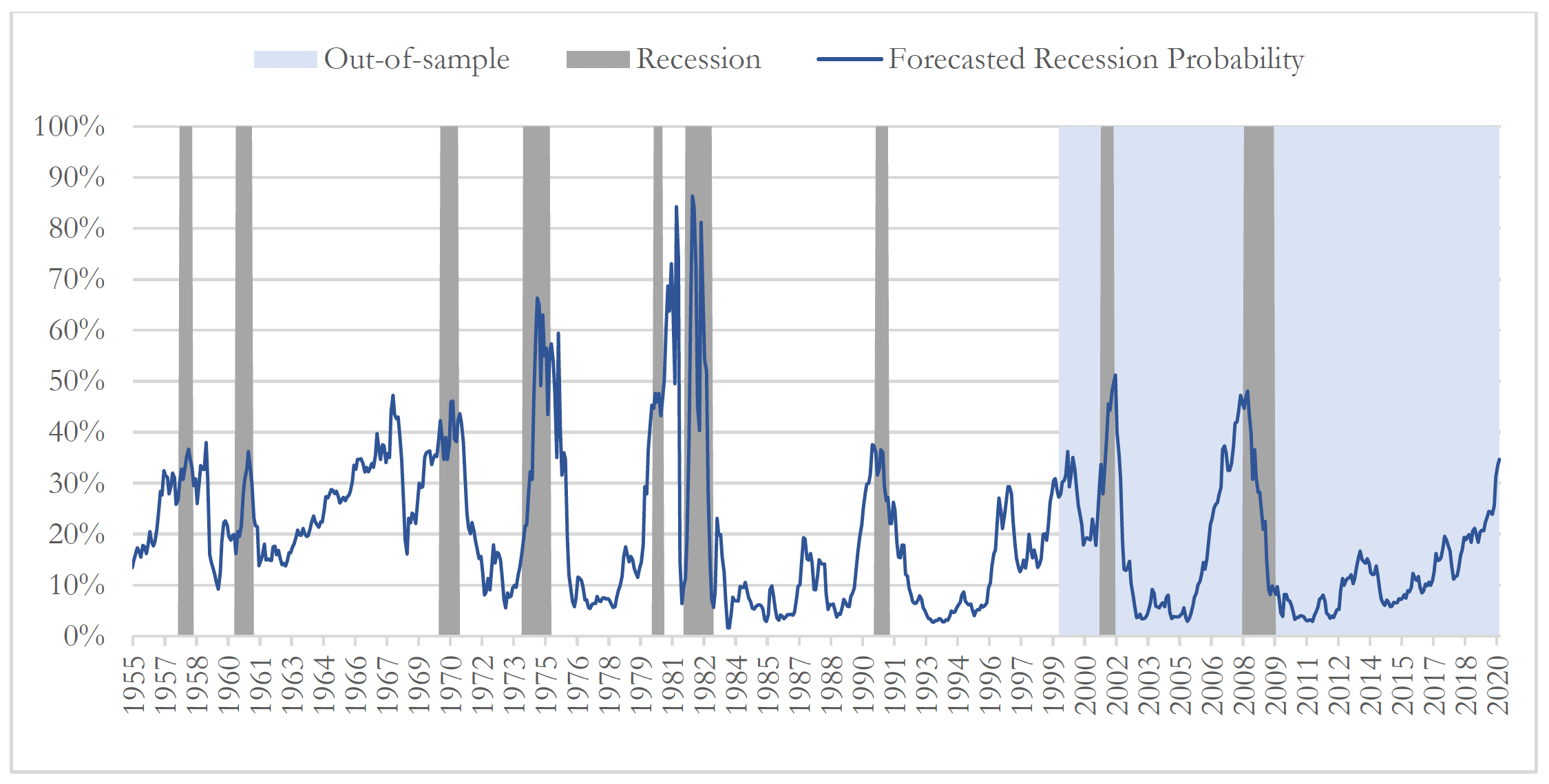
Chart 3: 12-Month Forecasted Recession Probabilities vs. Actual Recession Dates
We also found that the level of the Fed funds rate proved to be a fairly meaningful addition to our models, consistent with a research paper authored by Wright (2006). In particular, the 6-month and 12-month ahead predictive models that included both the current yield spread and Fed funds rate were better performing than models that only included the yield spread.
The significance of the Fed funds rate in the model could be explained by the fact that it is a closer indicator of the current stance of monetary policy and is less influenced by the term premium embedded in the yield spread. A tighter monetary policy, reflected by a higher Fed funds rate, has contractionary effects on the economy which, while dampening inflation, may increase the likelihood of an economic recession. Thus, the Fed funds rate appeared to bring valuable additional information about the business cycle to our models.
Chart 4 compares the 12-month predicted recession probabilities of the yield spread model (Model 1), to the model which includes both the yield spread and the Fed funds rate as predictors (Model 2).
Both Models 1 and 2 arrive at fairly similar probabilities during the post-war (1970+) recessions. Model 2’s primary improvement over Model 1 is lower estimated recession probabilities in non-recessionary periods (e.g. in the mid-1960’s, 1999 and 2013). Hence, it was more successful at reducing false positives.
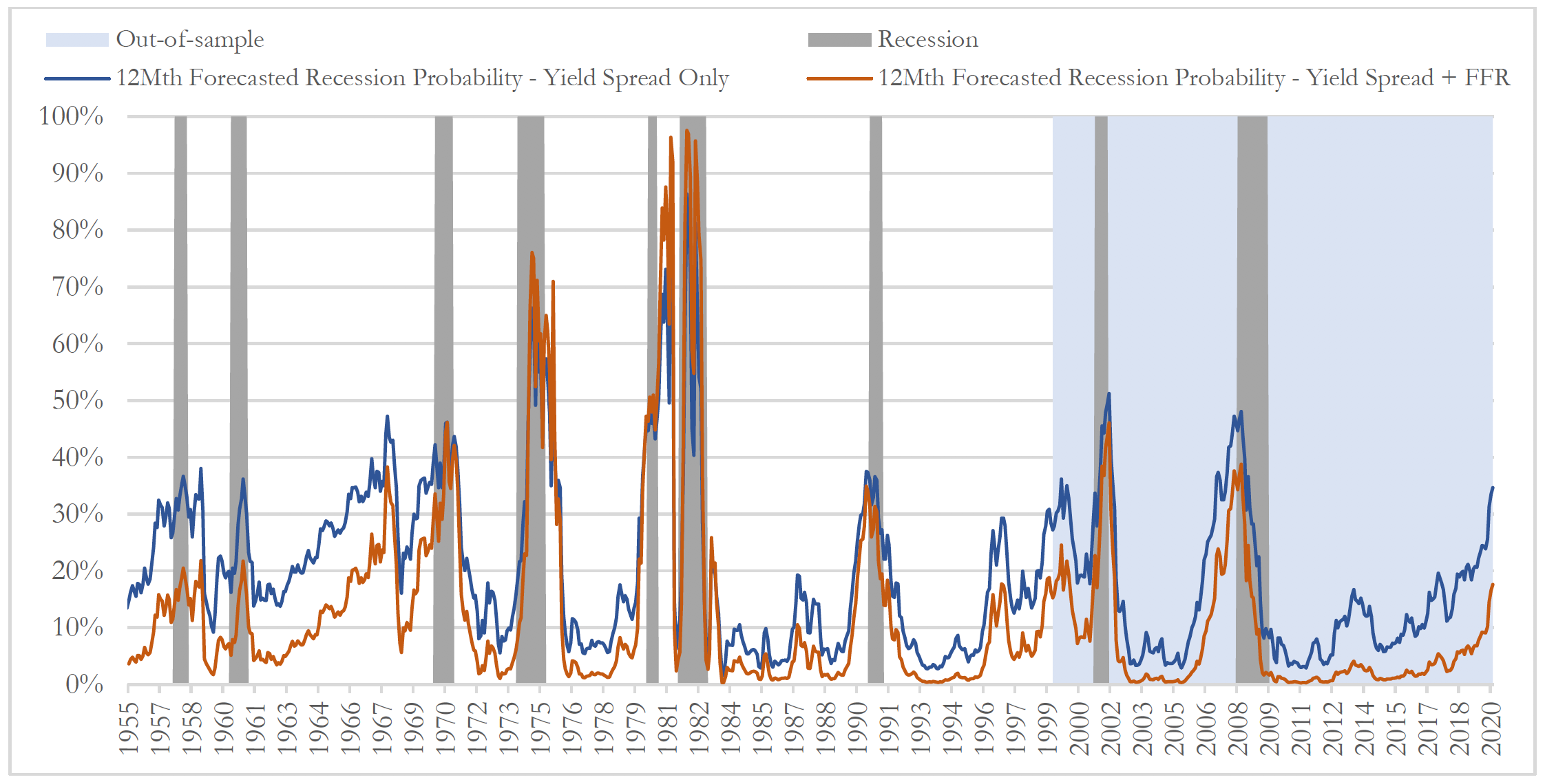
Chart 4: 12-Month Forecasted Recession Probabilities vs. Actual Recession Dates
Conclusion
It is noteworthy how useful the yield spread is in the prediction of recessions in the US. We also found that the level of the Fed funds rate was a meaningful supplementary predictor, which, together with the yield spread, improved the accuracy of the model.
Of course, it is interesting to see how the model applies today. Table 5 illustrates projected recession probabilities from Model 2 using current data on the yield spread and Fed funds rate. Nearing the end of March, the likelihood of a recession one year forward passed the 20% mark. Indeed, we estimated that probabilities as low as 16% could be a strong signal of a future recession5. The model suggests that if conditions trend in the same direction, we may head into a recession in 2020 or later6.
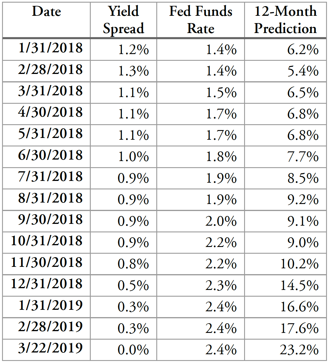
Table 5: Predicted Recession Probabilities 12 Months Ahead Based on Yield Spread and Fed Funds Rate
With any modeling exercise, it is crucial to be aware of the limitations of the model. As with most approaches, our analysis depends on the assumption of “ceteris paribus” (all other things equal). A myriad of factors could move interest rates in the opposite path in the future, including a more dovish Fed, the consequences of the 2020 Presidential election, trade developments, fiscal policy, and many more.
Moreover, there is a margin of error to the timing of the model predictions; for instance, the model predicted that the 2008 recession would begin in 2007.
Finally, as mentioned previously, the unwinding of the QE program could steepen the yield curve by raising long-term rates. However, at the time of writing, the Fed announced that it will end the balance sheet rundown of Treasuries at the end of September 2019, which is sooner than many anticipated and would leave the balance sheet at $3.5TN (compared to about $900BN pre-2008). Additionally, with the inflation rate still in the low 2% range, it is plausible that the Fed will hold off on further monetary tightening. Thus, both the short-term and long-term ends of the yield curve may remain depressed going forward, which produces competing forces on the yield curve’s recent tendency to flatten. Given the QE effect and today’s circumstances for monetary policy, it is possible that the current economic expansion may keep going longer than models or analysts predict.
As an exercise, not a recommendation, we apply the insights from this research to construct a hypothetical multi-asset class portfolio that is dynamically adjusted based upon forward-looking recession probabilities. Appendix III outlines the results, but we caution that there are too many assumptions inherent in this approach for it to be relevant for most investors.
Appendix I: Data Sources
Prior to 1959, the 3-Month Interest Rate was collected from the NBER Macrohistory Database, which provided the yield for 3-9 months notes and certificates from 1920-1937 and 3-month maturity from Dec 1937 to date. From 1959 onward, data is as provided by the NY Fed from an article by Estrella and Mishkin (1996), "The Yield Curve as a Predictor of U.S. Recessions".
Until the end of 1952, long-term interest rates are linearly interpolated from yearly data obtained from Sidney Homer's "A History of Interest Rates." From 1953 onward, data is the 10-year Treasury yield updated on the website of Robert J. Shiller for his publication "Irrational Exuberance" Princeton University Press, 2000, 2005, 2015.
The Treasury yield data for earlier periods may not directly comparable to that of later years. In fact, prior to 1930, the US Treasury sold bonds at fixed-price subscription rather than in auctions. Before March 1941, yields were also tax-exempt. Some data for short-term rates prior to 1937 is a mixture of 3- to 9-month notes and certificates.
Recent Treasury constant maturity yield data for the construction of the yield curve charts was taken from the website of the US Department of the Treasury.
The data for the Fed funds rate is the monthly effective rate from the Federal Reserve Bank of St. Louis, which itself originates from the “Selected Interest Rates” series by the Board of Governors of the Federal Reserve System. The data is available from July 1954 onwards.
For the equity market proxy, the S&P 500 Total Return Index was used. Prior to February 1988, a 4% dividend yield is assumed since the total return version of the index is not available for this period. The data for the index was obtained from Bloomberg.
Appendix II: On the Definition of a Recession
The technical definition of a recession is two consecutive quarters of decline in economic activity as measured by the real Gross Domestic Product. The NBER recession dates are arguably less objective, as these dates are based on implicit assumptions considering several factors such as real income, employment, manufacturing and sales, rather than just real GDP.
Below is a table comparing NBER to technical recessions. Similar to Estrella and Trubin (2006), the month following NBER business cycle peak dates is considered the start of a recession, since peak dates typically include a final period of economic growth. While GDP grew negatively in nonconsecutive quarters of 1960 and 2001, these periods would not qualify as recessions according to the technical definition – but they are defined as recessions by NBER’s standards. With the exception of the 1953 and 1969-1970 recessions, technical recessions tended to follow behind the NBER recessions. One explanation could be that the NBER may be taking into consideration certain leading indicators such as jobless claims in determining the start of recessions.
Appendix III: Practical Example of Model Insights in Asset Allocation
We back-tested a hypothetical portfolio to simulate an investor that uses the yield curve/Fed funds rate model as a guideline in asset allocation. Please note that back-tested, hypothetical performance does not reflect actual results achieved by our firm and is not an indicator of future results. It does not reflect actual trading activity or the effect of material economic and market factors on the decision-making process.
The results are shown in Chart 5. The first portfolio (Portfolio 1) is an equity buy-and-hold strategy that invests $1MM in the Vanguard 500 Index Fund (VFINX) from January 1987 to January 2019. The second portfolio (Portfolio 2) also invests $1MM in VFINX, but rotates into the Vanguard Total Bond Market Index Fund (VBMFX), whenever the model indicates a 6-month weighted average probability of a recession higher than 16% for that date7. Portfolio 3 is Portfolio 2 after taking into account taxes and transaction costs8.
The back-tested data indicates that Portfolio 2 outperformed Portfolio 1 during both the 1990 and 2008 recessions. It trailed behind Portfolio 1 due to a false positive in 1999-2000, but regained ground after correctly predicting the 2001 recession. Portfolio 3, on the other hand, underperformed until the 2008 financial crisis, where it caught up to Portfolio 1. The difference in performance between Portfolio 2 and Portfolio 3 largely results from the impact of capital gains taxes.
At the end of the sample period starting 1987, Portfolio 2 was valued at $32.1MM, compared with $21.9MM for Portfolio 1, and $23.4MM for Portfolio 3. Even though the design of Portfolio 2 and Portfolio 3’s repositioning rule is unsophisticated, it suggests an application of a yield curve model in asset allocation decisions. However, as previously noted, this may not be optimal for taxable accounts and depends on many assumptions. Notably, Table 1 (on page 4) shows that public equities did not always perform poorly during recessions; in fact, it gained significantly during some recessionary periods. Thus, we provide this exercise solely as food for thought. More broadly, insights on recessionary trends and the path of the economy may also help to guide practitioners in constructing capital markets assumptions for asset allocation, in estimating future earnings potential, or in assessing future inflation for capital budgeting models.
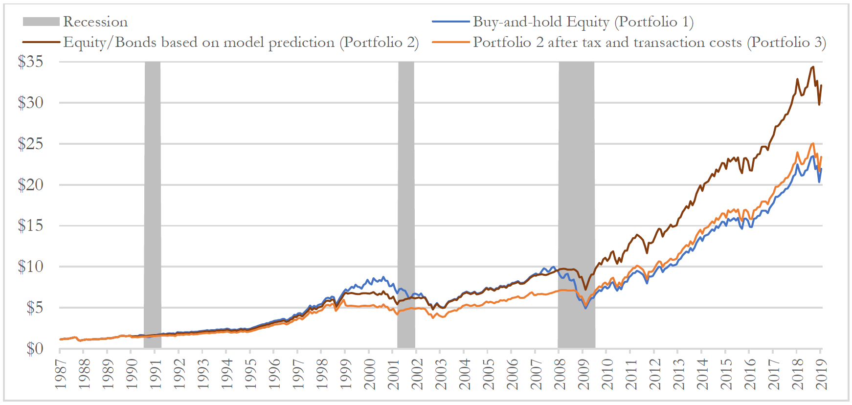
Chart 5: Hypothetical Performance of Strategy Based on Prediction vs. Buy-and-hold Equity
References:
Bernard, Henri, and Stefan Gerlach. "Does the term structure predict recessions? The international evidence." International Journal of Finance & Economics 3, no. 3 (1998): 195-215.
Bonis, Brian, Jane Ihrig, and Min Wei (2017). "The Effect of the Federal Reserve's Securities Holdings on Longer-term Interest Rates," FEDS Notes. Washington: Board of Governors of the Federal Reserve System, April 20, 2017, https://doi.org/10.17016/2380-7172.1977.
Cox, John C., Jonathan E. Ingersoll Jr, and Stephen A. Ross. "A theory of the term structure of interest rates." In Theory of Valuation, pp. 129-164. 2005.
Dueker, Michael J. "Strengthening the Case for the Yield Curve as a Predictor of US Recessions." Federal Reserve Bank of St. Louis Review 79, no. 2 (1997): 41.
Estrella, Arturo, and Gikas A. Hardouvelis. "The term structure as a predictor of real economic activity." The Journal of Finance 46, no. 2 (1991): 555-576.
Estrella, Arturo, and Frederic Mishkin. "The yield curve as a predictor of US recessions." (1996).
Estrella, Arturo, and Frederic S. Mishkin. "Predicting US recessions: Financial variables as leading indicators." Review of Economics and Statistics 80, no. 1 (1998): 45-61.
Estrella, Arturo, and Mary Trubin. "The yield curve as a leading indicator: Some practical issues." (2006).
Filardo, Andrew J. "How reliable are recession prediction models?." Economic Review-Federal Reserve Bank of Kansas City 84 (1999): 35-56.
Rudebusch, Glenn D., and John C. Williams. "Forecasting recessions: the puzzle of the enduring power of the yield curve." Journal of Business & Economic Statistics 27, no. 4 (2009): 492-503.
Stock, James H., and Mark W. Watson. "New indexes of coincident and leading economic indicators." NBER macroeconomics annual 4 (1989): 351-394.
Wright, Jonathan H. "The yield curve and predicting recessions." (2006).
Notes
- It is reasonable to say that the stock market contains some information about the economy. Whether stock performance indicates future recessions, however, is less clear, as stock price movements have not always shown a direct relation to the broader economy. Many past studies concluded that models using equity performance were generally less successful.
- There are meaningful differences in prevailing definitions of recession, but for this paper, we consider recessions as defined by the National Bureau of Economic Analysis. This definition is frequently used by academics and perhaps of more interest to investors because it considers signs of economic stress other than shown in GDP data, such as income or employment indicators. A brief comparison of NBER-defined recessions to the conventional “technical” definition of a recession is outlined in Appendix II.
- Prior to June 1976, yield data is monthly rather than daily.
- The complete methodology and derivation of the predictive yield curve models are outside the scope of this paper. However, for the benefit of diligent and curious readers, we look forward to publishing a version of this paper with greater technical detail.
- A discussion of the 16% “probability threshold” (the lowest probability estimated by the model that may be deemed as a high chance of a future recession) can be found in our more extensive research piece.
- We estimated that the probability of wrongly predicting that there will be a recession, given that there will be none in actuality, is roughly 10-20%. This is also known as a Type I error if the null hypothesis is defined as “no recession”. The estimated chance of a false positive is based on an analysis of the statistical sensitivity and specificity of the predictive models. Please refer to our research piece for more information.
- The forecast probabilities are averaged over six months such that more recent forecasts are given more weight. This smooths the prediction outcomes, which helps to prevent the portfolio from repositioning too frequently.
- Over the 30-year sample period, Portfolio 2 repositioned its assets 8 times. Portfolio 3 assumes a 20% tax rate for long-term capital gains, and a $30 flat fee per trade. There were no short-term capital gains for the sample period.
Forbes Family Trust (“FFT”) is a registered business name for FFT Wealth Management, LLC, a registered investment adviser. These materials are provided for informational purposes only and no portion of this commentary is to be construed as a solicitation to effect a securities transaction or the rendering of personalized investment, tax or legal advice.
Past performance is no guarantee of future results and there can be no assurance the views and opinions expressed herein will come to pass.
Investing involves risk, including the potential loss of principal. Market indices, if included, are for illustrative purposes only, as an index is not a security in which an investment can be made. Certain of the information discussed herein has been obtained from sources the Firm deems to be reliable, but FFT makes no representations with regard to the accuracy, completeness or timeliness of any information prepared by a third party and assumes no liability for the reliance thereon.
For additional information about FFT, please visit our website at www.forbesfamilytrust.com or consult the Firm’s disclosure documents, the most recent versions of which are available under FFT Wealth Management, LLC on the SEC Investment Adviser Public Disclosure website at www.adviserinfo.sec.gov.